CASE STUDY
Saas Application for Tracking & Managing Sales
PriceSpider • Created 2016

LEAD DESIGNER
UX / UI
UX WRITING
AGILE
USER RESEARCH
JOURNEY MAPPING
INFO ARCHITECTURE
DESIGN QA
A 1-year plus project where I served as solo lead designer working with 4-5 engineers, 1 product owner and 1 QA.
Contributing Engineers
Dave Templin
Joel Spitler
Ariella Vu
The Discovery Process

Understanding New Data. Big-Data.
When PriceSpider brought me in to rethink their MAP product application, I was given a brief overview of the product in about 45 minutes. Of course, I'm sitting there soaking it in and listening. Saying to myself, what is MAP? By the way, it stands for Minimum Advertised Pricing (MAP).
After many hours of performing an initial usability evaluation (heuristic), I came to the conclusion that I just didn't understand the data clearly. What are the relationships? What is the definition of each data point? This was not simple to grasp at first.

Current Problem with Usability
One of the main problem statements PriceSpider had with the current state of the application, was about 5% or less of their users were actually using it. Most clients chose to receive custom report files sent by email that were configured by an Account Manager. This not only cost resource time, but the greater cost was the lack of a usable client application.
Being that PriceSpider followed more of a startup philosophy, which is something like "minimize research and implement tomorrow". I still felt it necessary to adopt some UX practices to help educate the PriceSpider team, and most importantly, by creating both an experience map and user personas, I can begin to design an experience where features are organized, prioritized, and feasible for an MVP.

Catching Changes Early On
It happens, right? This project just made 3 u-turns and ran a red light. Here's the story – Instead of one application, it was decided to build 5 unique SaaS applications into one complete offering. PriceSpider stakeholders discovered that it's no good if we focus on one and suffer from lack of planning and continuity. Of course, I am in total agreement with this decision. Best to know the future plans for scaling an application.

Updated Site Map to Reflect the Revised Requirements
Initial Ideation


Wireframes
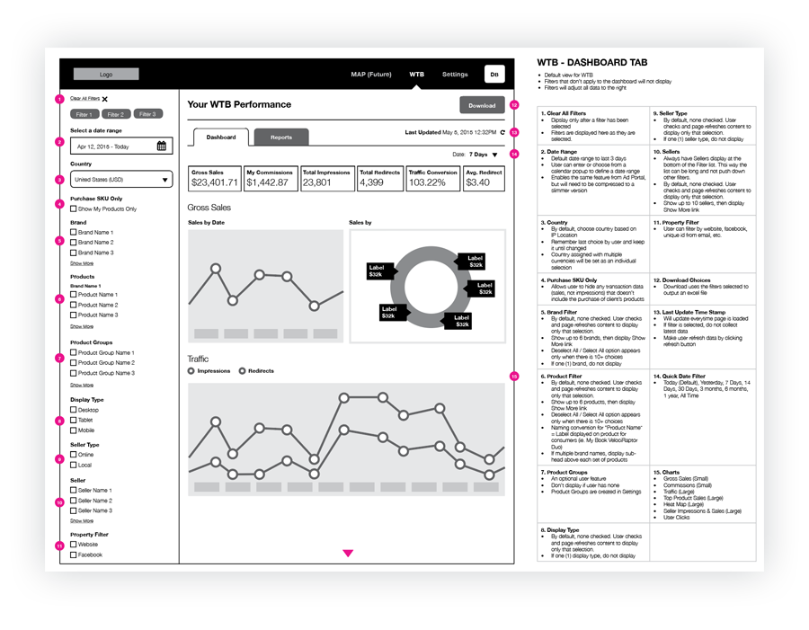
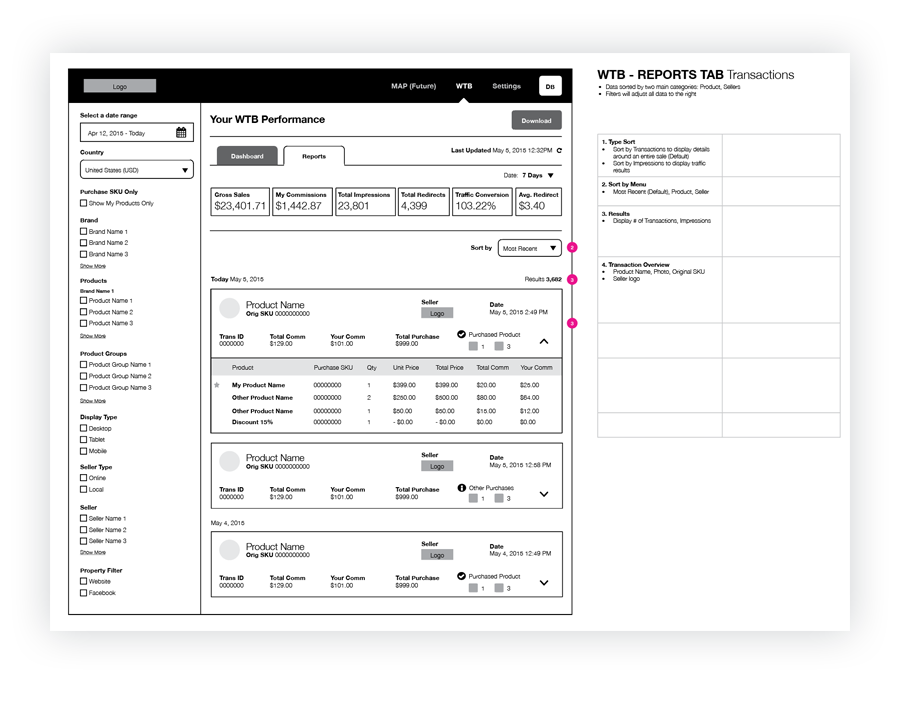
During this stage of the process, we started building out the Where to Buy application. The focus here was to address how a user can filter their dashboard experience based on a variety of users who may manage multiple brands or manage every product line across multiple brands. One of the problems we wanted to solve was: How does a user investigate further into a single point on the dashboard? To solve this, every point on a graph or table on the dashboard is clickable to a reports page that is filtered by that selection.
Visual
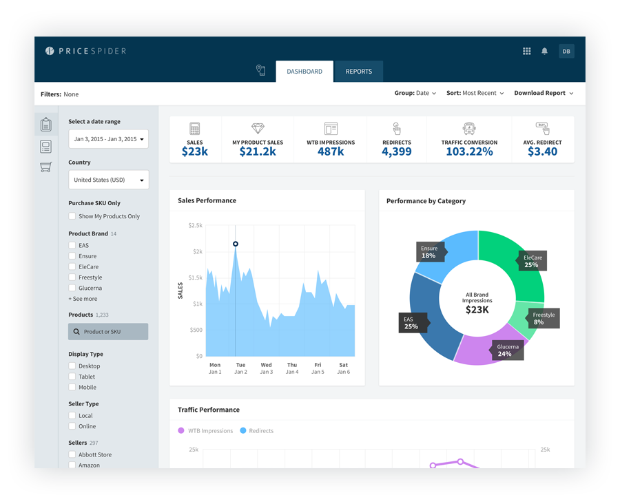
To begin this process, I started with identifying the best color scheme and typeface to reflect the PriceSpider brand. Since PriceSpider was still a small business, their brand hadn't matured much. One of the biggest learning lessons out of this project, is to build your design system earlier and often. Define each and every UX pattern. During this time, I was using Photoshop and had been exploring Adobe XD and Sketch. Happy to say, I'm now working in Sketch. Upon delivery of my visuals to development, I did two things. One, I walk them through the interactions using InVision prototypes. Second, I walk through the Adobe Assets tool on specific CSS to use.
Example Pattern Libraries


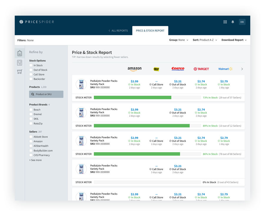
After an MVP was designed and released into production, some improvements to the navigation and filters panel was needed to improve a user's experience for manipulating dashboard and report page data. The UI Pattern Examples shown above demonstrate the both execution and complexity of the project.
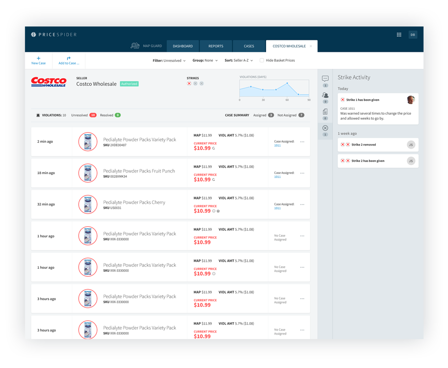
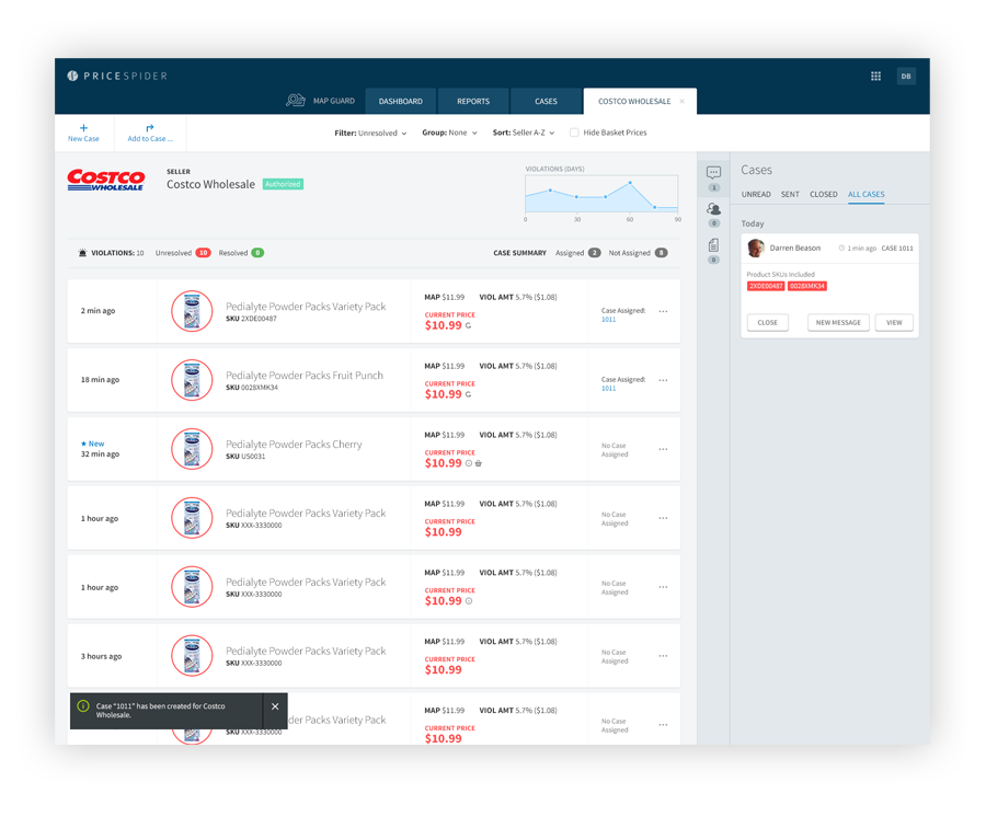
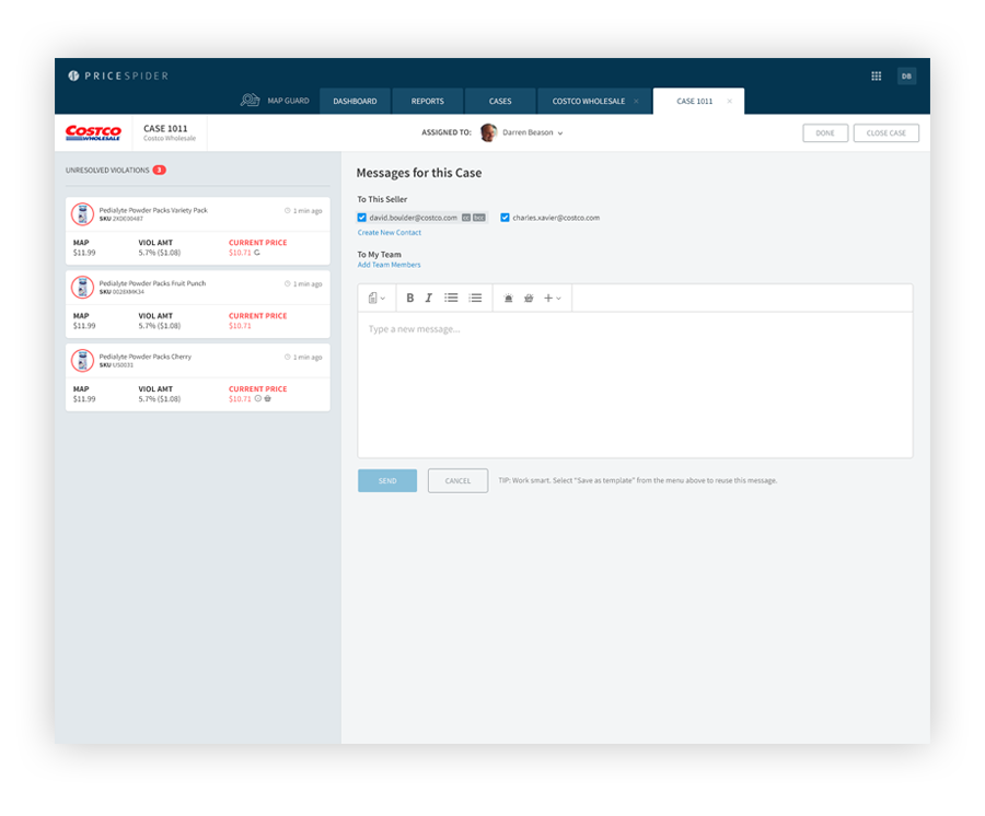
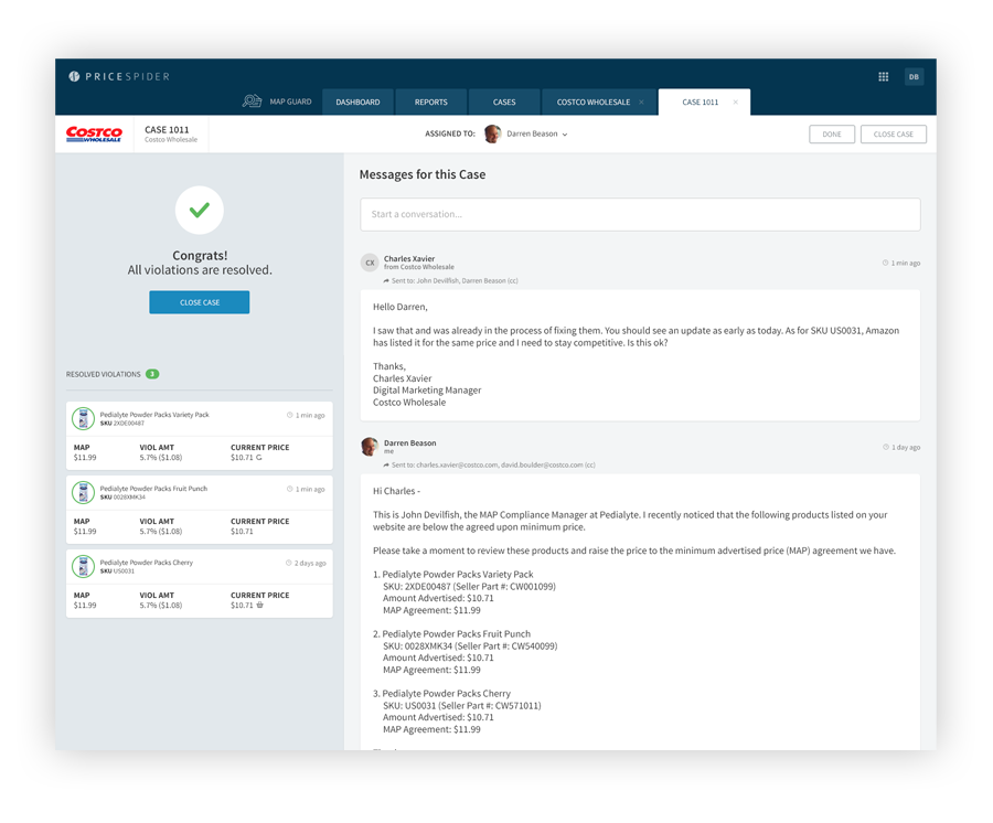
Users can view which products are being violated by this retailer. From here, a user can select products with prices that violate their policy and create (or add to) a case to help track and communicate directly with the retailer.
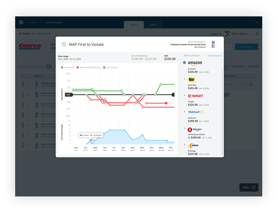
Users here can view a pricing trend for a selected product across retailers. The tool includes drag-and-zoom controls giving the user a quick way to investigate into a shorter date range. When building this feature, we had originally scoped out a lightbox implementation in order to apply it in several areas of the appplication. However, some customers feedback expressed the tool being very useful, but would like to see it on it's own page.
Sample of Icons
