CASE STUDY
Credit Card Marketplace Redesign
Experian • Created 2019


LEAD DESIGNER
UX / UI
UX WRITING
AGILE
ANIMATION
INTERACTIONS
DATA STRATEGY
USER TESTING
RESPONSIVE
WORKSHOPS
ENGINEERING SYNC
DESIGN QA
A 6-month long project comprised of 3 product owners, 3-4 engineers and 2 designers. I served as lead designer.
Contributing Designer
Warren Tsang
The Challenge
OVERVIEW
With over 100M subscribers, Experian offered a variety of member services such as identity services, credit reports – and credit card offers. However, the current solution that provided personalized credit card offers was not generating the click-to-approval conversion rates Experian was targeting.

PREVIOUS DESIGN
USERS HESITANT TO APPLY
A big concern for users is applying for an excessive amount of credit cards. Users didn't want to inadvertently lower their score. Users wanted to know if they would get approved or not, or at least what were their chances.
NO CREDIT USAGE HISTORY
Being Experian is one of the largest consumer credit reporting companies in the world, their current solution had no visibility of a user's current credit use that provided users with insight.
EXPERIENCE LACKING EXCITEMENT
The current user experience was underwhelming, using a traditional shopping experience design approach with very minimal excitement when users were arriving on the page.
INDICATION OF ASSURING APPROVAL
The users were only being matched to the credit card partners fico score range, which in some cases didn't apply to other factors of a credit approval.
Highlighted Result
10% year-over-year increased revenue from prior experience due to increase conversion
The Approach
Discovery work with Experian to understand users and business goals to create value-based solutions.

Learning the Users
-
Multi-day workshop with 10+ Experian stakeholders and subject matter experts
-
Define user personas
-
Understand market potential
-
Review current data analytics of experience

Expand the User Journey
-
Target personas with personalized credit data
-
Add a credit card comparison feature
-
Introduce welcome and educational touchpoints
Testing the Prototype
To validate minor and broad assumptions, the user test focused on 4 new features based on an individual user's ability to recognize, motivations to interact and navigate.
No of Users
12 Experian Paid Users
Desktop / Mobile
50% Mobile / 50% Desktop
Avg Session
24m
LOW-FIDELITY PROTOTYPE
Validating New Features
Personalized Headlines
Credit Profile
Credit Match Percentage
Comparison Tool
Top 3 Credit Cards


What did we want to accomplish?
Personalized Headlines Using Criteria-Based Data
By providing recent credit usage total, our goal was to try and demonstrate Experian's data-driven knowledge to provide guidance as to what types of credit cards would support their current credit situation.


Your Credit Profile Summary
Combining detailed credit profile data such as FICO score, credit usage, credit card balances, and educational tips, we could give users a good idea on how to choose the right credit cards.
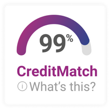
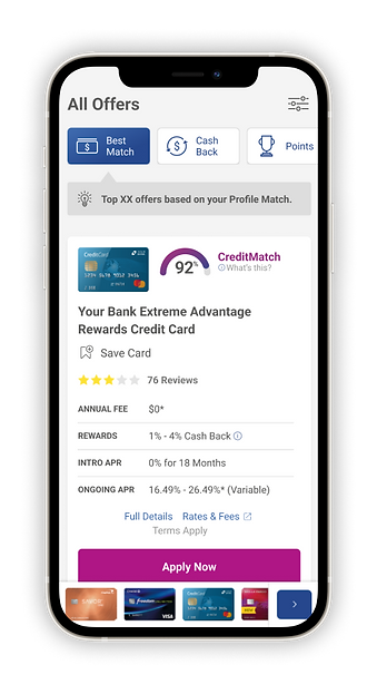
Credit Match Percentage
The credit match percentage was a combination of data from the credit card companies, combined with a user's credit profile to generate a percentage that would drive users to apply for a credit card they felt they would get approval.


Credit Card Comparison Tool
This tool was a common feature found on other websites to enhance the user's ability to make a decision quick and easy. Our main goal was to get a sense of awareness from users.
Top 3 Selected Cards
To support the headline and the credit profile summary, our goal here was to see if highlighting top matched cards for a user would make an improvement over a standard results listing.

Outcomes
The Credit Match % calculation formula was assumed by users that Experian knew everything, and the expectations from users was that Experian should have accurate data.
The Comparison tool on both desktop and mobile was difficult for users to find quickly which was somewhat expected based on our priority of feature priority.
The Credit Profile summary allowed some users to have more knowledge and direction on how to choose the right type of credit card (ie. rewards, intro-apr).
The top 3 credit cards was not received positively or negatively by users, but more that is was common.
Final Product Design


Scrolling the page


The Evolution of Credit Match Design
From an ambiguous statement, to an intuitive and simple execution to motivate users. At first, we wanted to break down each data point that supported the total percentage, however, we soon determined that the large footprint and responsive behavior of this module would become too difficult.


The Credit Snapshot Personalized Capabilities
Each of the 3 tiers of cards are dynamically displayed based on a set of user profile rules that could be from a user with very little credit cards, to communicating about no inquires.
Credit Usage


Credit Tips


Credit Card Comparison Tool
A power tool for users who are deep-diving into multiple cards to allow them to align the fine details of each offering to improve their decision-making.
