
The challenge
Credit marketplaces ask users to compare complex offers while feeling vulnerable about personal financial data. The experience had to make choices easier without oversimplifying the decision.
Experian
A marketplace redesign focused on helping people understand their credit picture, compare relevant offers, and move forward with more confidence.

Credit marketplaces ask users to compare complex offers while feeling vulnerable about personal financial data. The experience had to make choices easier without oversimplifying the decision.
I focused on clarity, trust cues, comparison structure, and mobile-first decision moments so people could understand why an offer mattered and what to do next.
The redesigned marketplace improved user confidence and drove a measurable 10% conversion increase within the first year of launch.
Process
The product needed to feel useful, trustworthy, and scannable across a wide range of financial literacy levels.
Looked at where users needed reassurance, comparison help, and better explanation of why offers appeared.
Structured card, rate, fit, and action content so comparison became less mentally expensive.
Prioritized thumb-friendly flow, readable hierarchy, and clear next steps in smaller spaces.
Kept design decisions connected to adoption, conversion, and user comprehension.
Artifacts
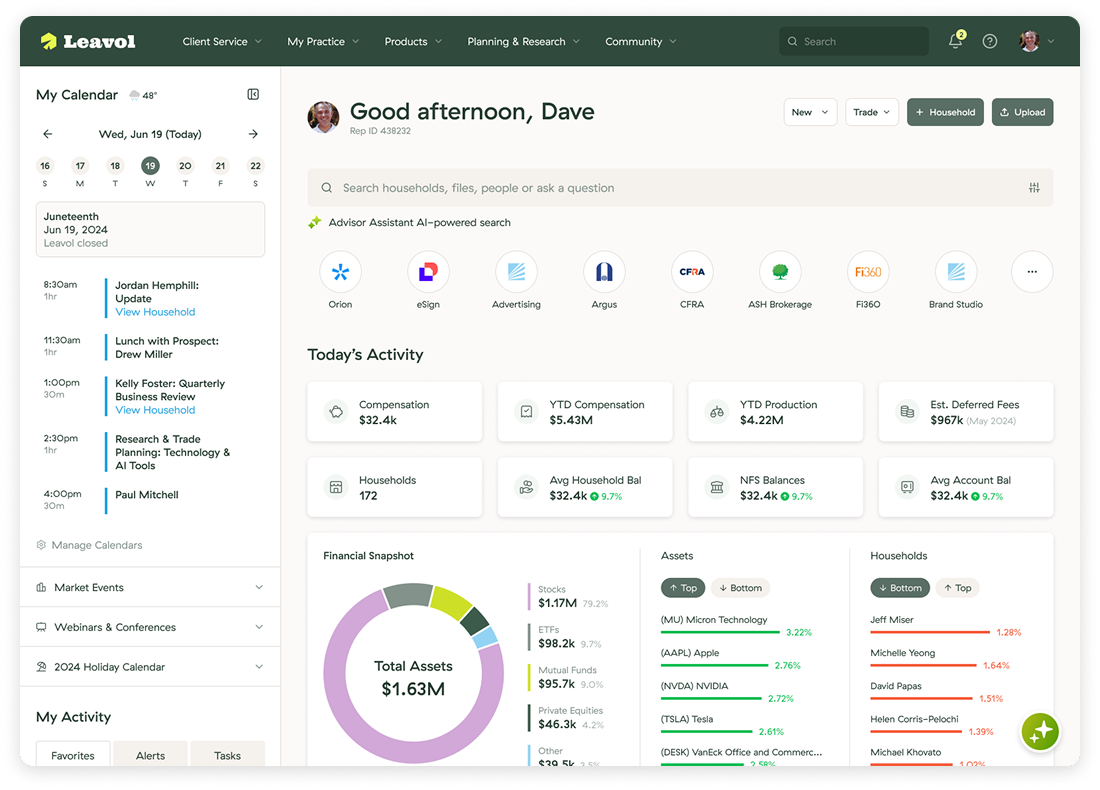
Interface exploration for presenting financial status and next actions together.
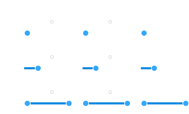
Clear controls for data-heavy products where users adjust values and compare scenarios.
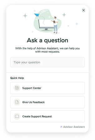
Question-led decision support for users who need help getting to the right recommendation.
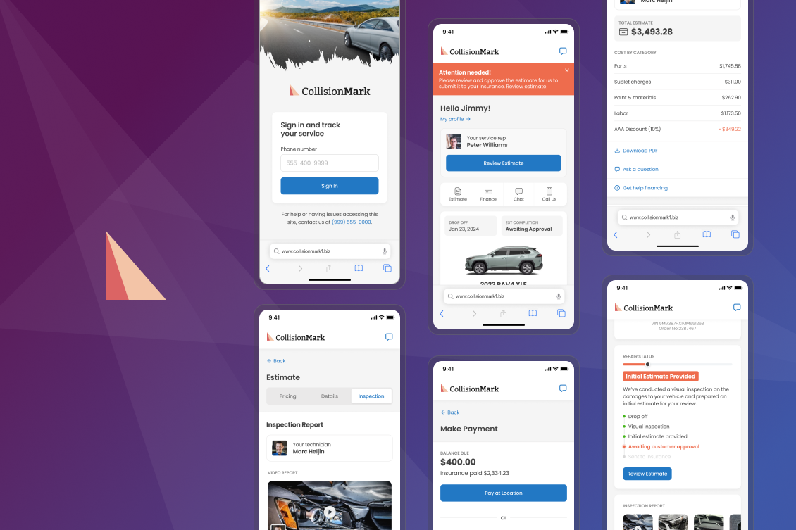
Mobile screens showing how product detail, lists, and action moments can be composed.
Prototype work used to test comprehension, sequence, and interaction rhythm.
Outcome-driven design framed around usefulness, trust, and measurable lift.