
Created a shared foundation for internal tools that had been evolving independently.
Case Study West Monroe 2023
Wemo Design System
Built the system around reusable decisions rather than one-off page decoration.
Structured documentation and component properties around the people using the system daily.
Gave teams a clearer starting point for product work and handoff decisions.
System Thinking
How I approached the work beyond making a component library.
This case study is about system thinking, not just UI inventory. The value was in creating structure that could survive active delivery work, designer preferences, and engineering constraints.
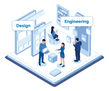
Aligned product teams around shared decisions
I framed the system around recurring product choices: color use, spacing, naming, variants, component states, and patterns teams were already rebuilding.
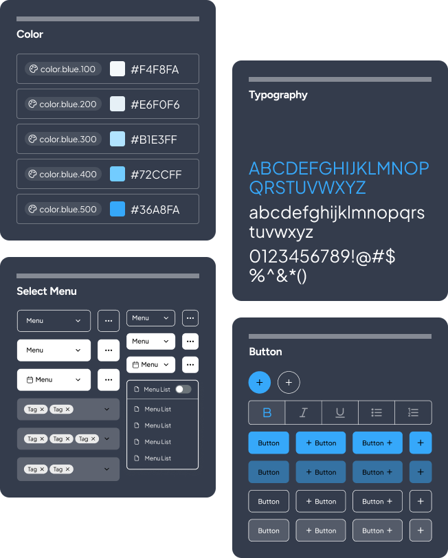
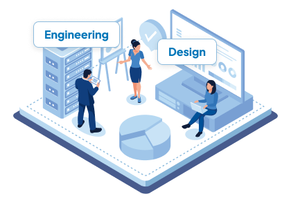
Designed the system experience inside Figma
I treated the library itself as a product, with findable structure, useful properties, clear prompts, and documentation that reduced hesitation.
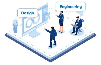
Bridged design standards and implementation reality
The system was shaped to help engineers map visual decisions to reusable product behavior instead of interpreting static mockups every time.
The purpose
To create and deploy a design system to align with 3-4 internal tools designed and built by individual product teams.
Wemo Design System
What problems were we solving?
The system needed to remove recurring decision debt without turning into a heavy process layer teams would ignore.
Consolidating styles
Convert all styles into a single system by addressing primitives first, then semantic styles, and tying them together using variables.
Component framework alignment
Select a UI framework such as Material or Mantine that all teams could agree on.
Eliminate custom components
Find and convert one-off custom or embedded elements that were not componentized.
Reduce time and resources
Minimize the effort for designers and engineers to build out experiences from scratch.
The research
How do I determine a design system framework that works best for users?
Before building, I studied familiar UI frameworks and design systems so the library would feel intuitive to designers and legible to engineers. The goal was not to copy a system, but to choose conventions my users could recognize quickly.
I compared examples from product teams and community libraries, looking for patterns in naming, navigation, component anatomy, and variant behavior.
Material UI
Atlassian
Salesforce
IBM
Airbnb
Mantine


Some of the key areas I focused on during the initial setup in Figma.
Organize
Identify a hierarchy to organize the Figma file to match common UI component libraries and design systems.
Naming
Name each component, component part, and variant to reduce ambiguity and improve findability.
Properties
Break down components so their properties were mostly binary and easier to adjust.

Planning a phased approach in order to minimize issues.
Rather than asking teams to adopt everything at once, I sequenced the work from foundations to patterns so each layer could validate the next.
I started with reference mockups so the team could agree on visual direction before system decisions became reusable rules.
The Figma file needed a clear page structure, naming rhythm, and contribution model before components could scale across teams.
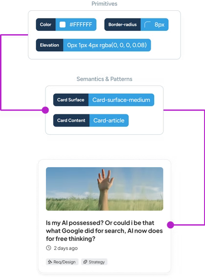
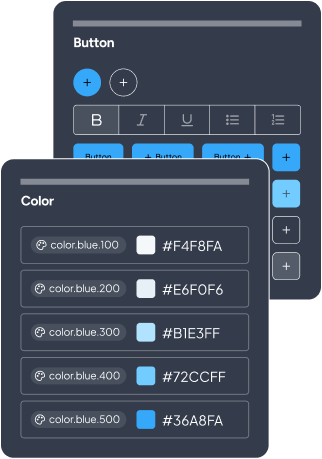
I defined the primitive building blocks first, including color, type, gradients, elevation, and radius styles.
Semantic and component tokens connected those primitives to product intent, so teams could choose by use case instead of guessing values.
Spacing and grid tokens gave designers predictable layout decisions that could survive different screen sizes and product contexts.
Basic components came next, focusing on shared controls like buttons and text fields that appeared across every internal tool.
Once the smaller pieces were stable, I moved into complex components like date-time pickers, modals, and multi-state patterns.
Finally, I captured repeatable page and workflow patterns so teams could compose familiar experiences without starting from scratch.
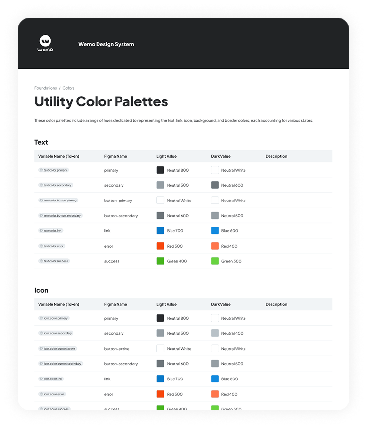
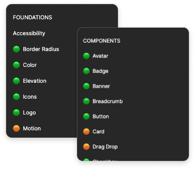
The foundation
Using variables in our design system was going to minimize ambiguity and promote scalability effectively.
Variables used in the initial phase
Primitive
- Colors
- Font size
- Font weight
- Letter spacing
- Line-height
- Border radius
- Icon weight
Semantic
- Text colors
- Action colors
- Surface colors
- Border colors
- Type styles
Components
- Buttons
- Cards
- Text fields
- Chips
- Snackbars
- Menu
- Tabs
User goals for using variables
Reduce guessing for designers and let them focus on creating the experience.
Help engineering mirror variants from the design system into the UI component library.
Guidelines and specs
Documenting the system so designers and engineers could move with less ambiguity.
The guidelines provided naming conventions, variants, technical and functional specifications, and implementation cues to help both designers and engineers create or implement with little-to-no ambiguity.
Figma components and property setup
Building an experience inside Figma for designers.
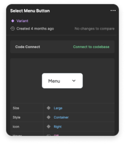
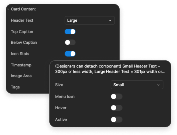
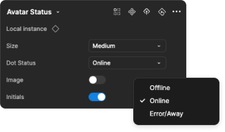
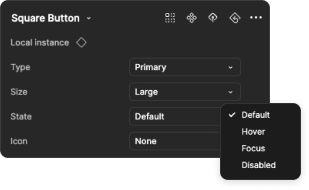
When designing components, I carefully structured properties into clear prompts so designers understood how to change states, variants, and behaviors. It was essentially a user experience inside the design system for user experience designers.
Avatar status and status dot
Component
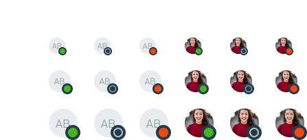
Property menu
Button
Component
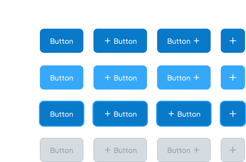
Property menu
Slider
Component
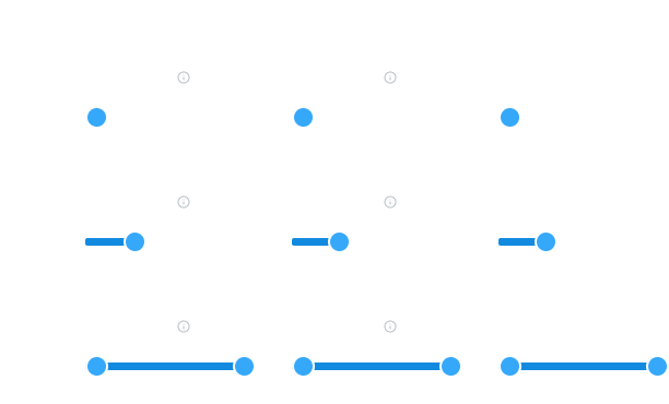
Property menu
The system made everyday product decisions easier to repeat, explain, and hand off.

For designers
Less time guessing, more time designing the experience.
Tokens, naming, and component properties created a clearer path from rough concept to high-fidelity product work.

For engineers
More explicit component behavior and handoff details.
Property menus, component specs, and examples helped reduce interpretation during implementation.
For teams
A reusable foundation for future internal tools.
The design system gave teams a shared starting point while still leaving room for product-specific decisions.