Lead with useful content
Components support the work instead of decorating around it.
A wiki for the visual foundations, reusable components, and page patterns that shape this site. It is organized like a lightweight product system: tokens first, then components, then composed sections.
Overview
The system keeps the portfolio quiet, structured, and scan-friendly while still giving interaction details enough polish to feel designed. New pages and components should reuse these global tokens, components, and patterns before introducing anything new.
Components support the work instead of decorating around it.
Buttons and cards use restrained depth cues, not heavy shadow.
Colors, spacing, cards, media rows, chips, and overlays stay reusable.
Foundations
Core tokens balance a white product canvas, a cool gray documentation surface, a purple case-study eyebrow, and a -45 degree Atomize brand gradient blending Pink 600, Purple 700, and Blue 500.
#101318#5F6B7A#2563EB#DB2777#7E22CE--case-eyebrow-color#3B82F6#8FB1FFrgba(143,177,255,.10)--brand-gradient--wemo-hero-gradient#FFFFFF#F1F4F9#E7EDF8#0B0F16#141A24#1E2633#DCE3EEFoundations
The type system uses Google Sans Flex with reduced heavy weights, tight heading rhythm, and calmer body copy for dense product content.
Hero text style
Section text style
Card title style
Body text style for standard paragraphs.
Foundations
Spacing is intentionally modest inside components and more generous between sections, keeping the interface scannable without feeling loose.
Micro gaps
Grid gaps
Component padding
Compact sections
Major sections
Foundations
The site uses four core viewport labels. Use the range first, then common viewport widths as a quick reference.
Common widths: 1280, 1440, 1512, 1728
Common widths: 1024, 1112, 1180
Common widths: 768, 820, 834
Common widths: 320, 375, 390, 430
Foundations
The system keeps cards, controls, media frames, and panels at a 12px radius. Buttons and compact chips keep their tighter 8px radius so smaller controls stay crisp.
12px for cards, controls, media frames, and panels. Buttons and compact chips stay at 8px.
Soft blue-gray shadows only where the element needs separation.
Foundations
Scroll reveal uses a subtle fade-up and applies globally to reusable .reveal elements, including longform case study sections. Interactive controls use a short lift with a depth plate, while default cards use a restrained scale and elevation change.
Content enters with a small upward move, opacity fade, and parent-level stagger.
Begins immediately.
Follows one beat later.
Completes the group.
Foundations
UI icons use Hugeicons line symbols embedded as an inline SVG sprite on each page, then referenced with local fragment IDs. This keeps icons visible from local files and hosted pages.
Components
Buttons hug their text by default. Single-button mobile actions can span full width when the layout needs a larger tap target. Dark mode primary buttons use Info 500 for accessible contrast, while secondary buttons keep a solid surface face with softer blue border and hover states.
Components
The header is fixed, transparent by default, compact on scroll, and inverts when it crosses a dark section without adding a baseline shadow in its default state. Once scrolling begins, the compact header restores the baseline for separation. Case Studies is a non-navigating dropdown trigger with direct links, thumbnails, company labels, and generous 20px menu padding; desktop dropdowns open on hover or focus, include a forgiving hover bridge for pointer movement, and auto-dismiss once the cursor moves more than 500px away. Dark-mode nav hover states use a quiet blue-tinted surface with blue text so the active target stays visible without becoming too bright. Icon actions use filled symbols sized to match the settings control.
 Darren Beason
Components
Case study pages use a lightweight pager instead of breadcrumbs: a secondary Home button on the left and a secondary Next button on the right. It keeps orientation simple for hiring managers while moving them through the case study set.
Components
The site defaults to light mode, persists the selected mode, and can inherit the browser or OS color scheme when System is selected. Internal page links carry the current mode as a handoff for local file previews, so the preference survives navigation even when the browser isolates local storage per HTML file. Desktop navigation uses a settings icon dropdown that opens on hover or focus, auto-dismisses when the cursor moves far away, and contains the Design System link plus Light, Dark, and System choices under a MODE eyebrow, with a checkmark for the active preference. A first-visit helper points to the settings icon, contrasts against the active theme, auto-hides after 6 seconds, and dismisses on close, scroll, or navigation. On mobile, these same options sit directly inside the opened mobile menu.
Want to switch modes?
Select light or dark
Components
The DB logo triggers a 0.95s continuous swirling pixel burst on hover or focus, using blue, purple, and light green dots that radiate from the logo mark.
Darren Beason
Particle dots follow curved in-and-out paths in a roughly 100px radius, then fade and remove themselves from the DOM.
Components
The persistent page utility stays fixed in the lower-right viewport and appears only after a user scrolls beyond the initial viewport height.
Hidden by default, keyboard-disabled while hidden, then fades up once the user has scrolled more than one viewport.
Components
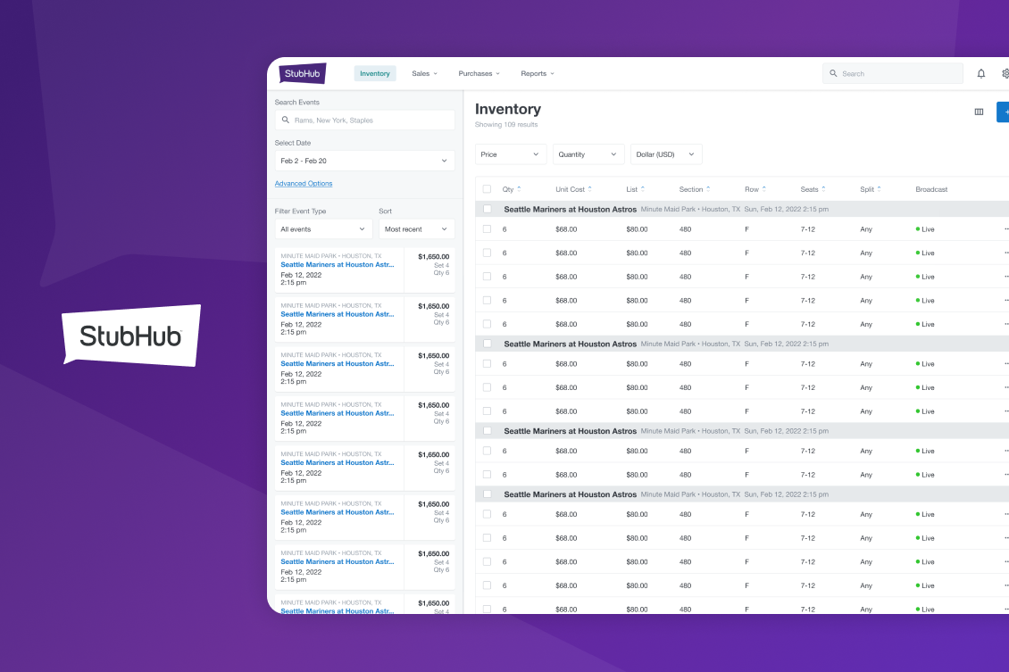
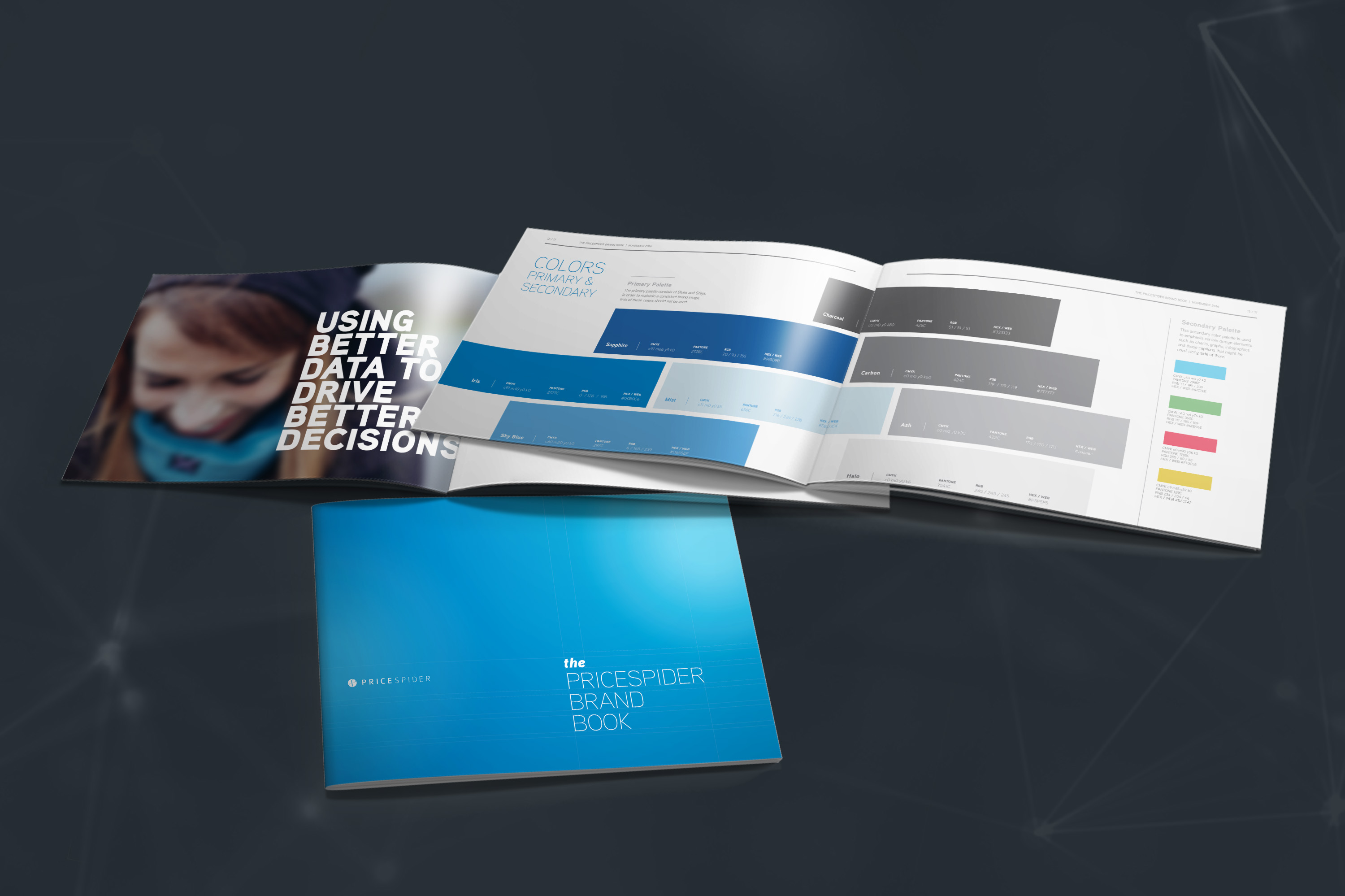
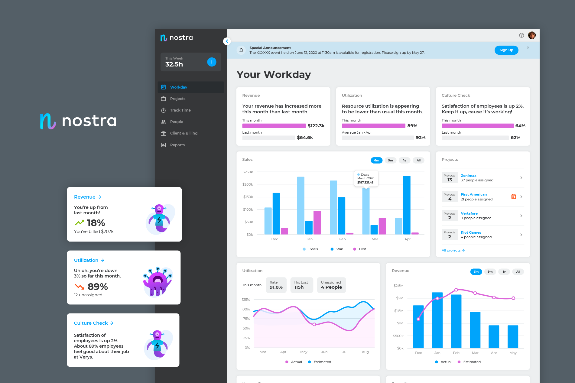
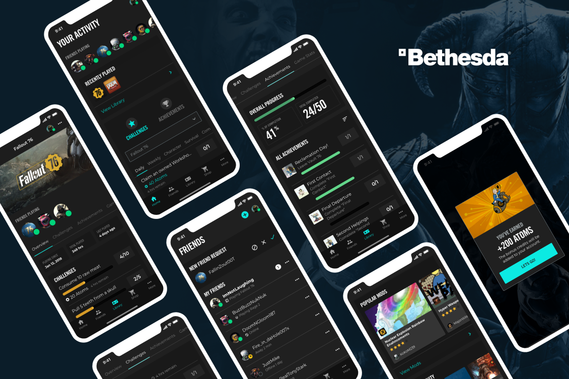
Featured case cards live in a full-bleed horizontal carousel so adjacent work can peek outside the page margins. Cards are narrow by default and expand horizontally on hover or focus. Each card uses a vibrant solid Atomize color surface, a fixed-size masked background image layer that sits mostly cropped off-canvas until hover, a left fade that blends the background into the solid surface, foreground product artwork tuned per card with high-resolution assets, custom transform origins, container-free icons, and a fixed-width delayed description reveal where the icon and text slide in from the right with a slower fade-in and fade out quickly on release. PriceSpider is the exception with two stacked foreground images. Cards avoid borders and shadows so the carousel sits cleanly on the page background. Pagination uses a light-to-medium gray active dot with inactive dots one gray step softer.
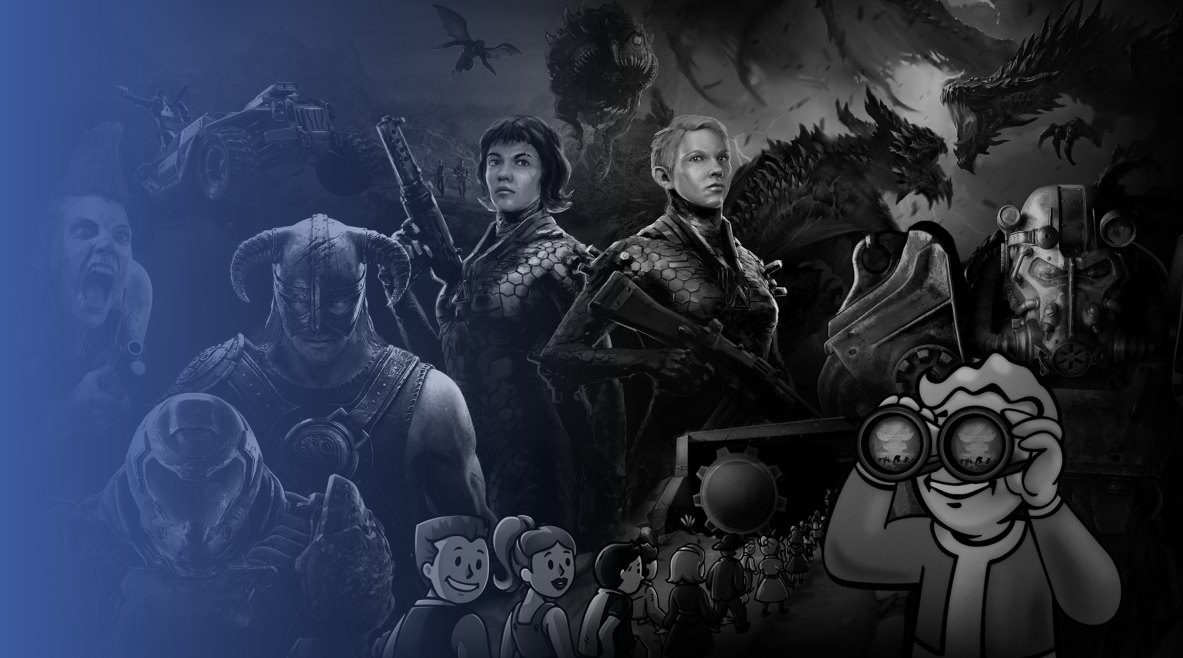
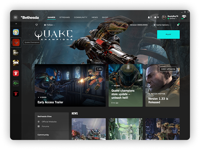 Bethesda
Supporting descriptions stay tucked away until hover or focus, then slide in from the right after a short delay and fade out quickly on release.
Components
Small case links are compact, led by Hugeicons symbols, and use a purple face lift where the visible surface moves while the hit target stays stable to avoid hover flicker.
Components
Prototype entries use muted autoplay loops with no visible controls in a stacked showcase layout. Media wrappers must hug the source video edge-to-edge: use the native video ratio, a thin border stroke, and a radius mask, with no padded frame or visible whitespace around custom video sizes. Desktop rows pair that media with a vertically centered text block separated by full-viewport divider lines that sit behind the media. Alternating rows can reverse the media/text order. Mobile keeps each entry stacked with the video first and text below.
A compact example of the media-plus-copy row used in the design showcase.
Components
Image thumbnails sit inside the Design Showcase section as a secondary sub-pattern, introduced by a centered eyebrow with a large 208px separation from the prototype rows. The desktop pattern uses borderless square crops in both light and dark mode, custom image positioning, and the standard hand cursor to signal that each item opens the larger image overlay.
Concept Examples
Components
Chips collect skill tags and concise capability labels in dense groups. They use a light/medium gray fill without borders, keep an 8px compact radius, and pair each label with a unique Hugeicons symbol.
Components
The image overlay uses a blurred dark backdrop, a white content panel without caption text, a viewport-level translucent close control that darkens on hover, Escape close, and focus return.
Components
Case study spec galleries use a horizontal snap carousel for dense documentation screenshots. Each card preserves a consistent thumbnail crop, opens the shared image overlay on click, and includes overlay arrow controls that appear on carousel hover or focus only when more content exists in that direction.
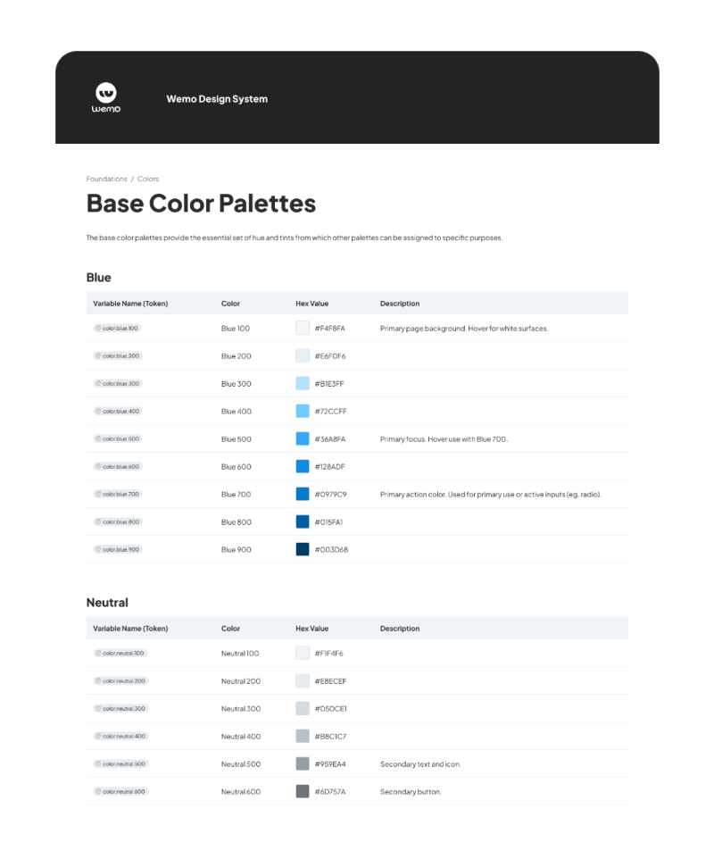 Base color palettes
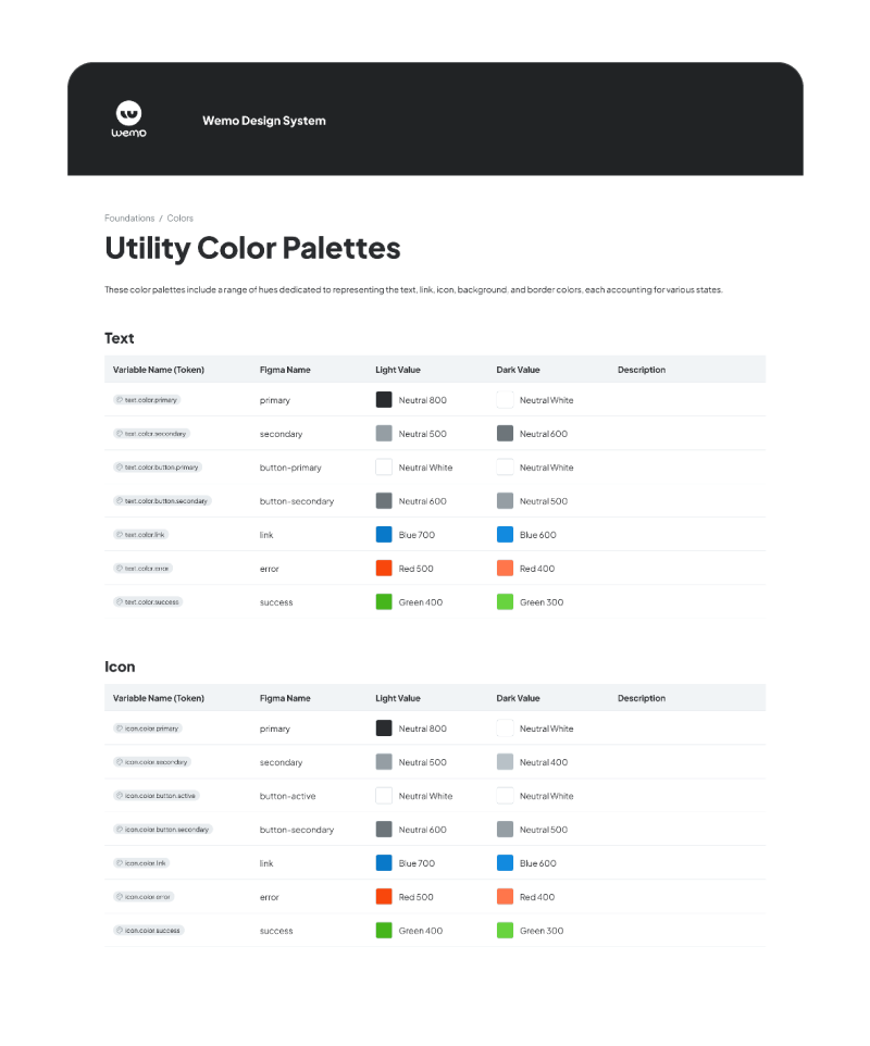 Utility color palettes
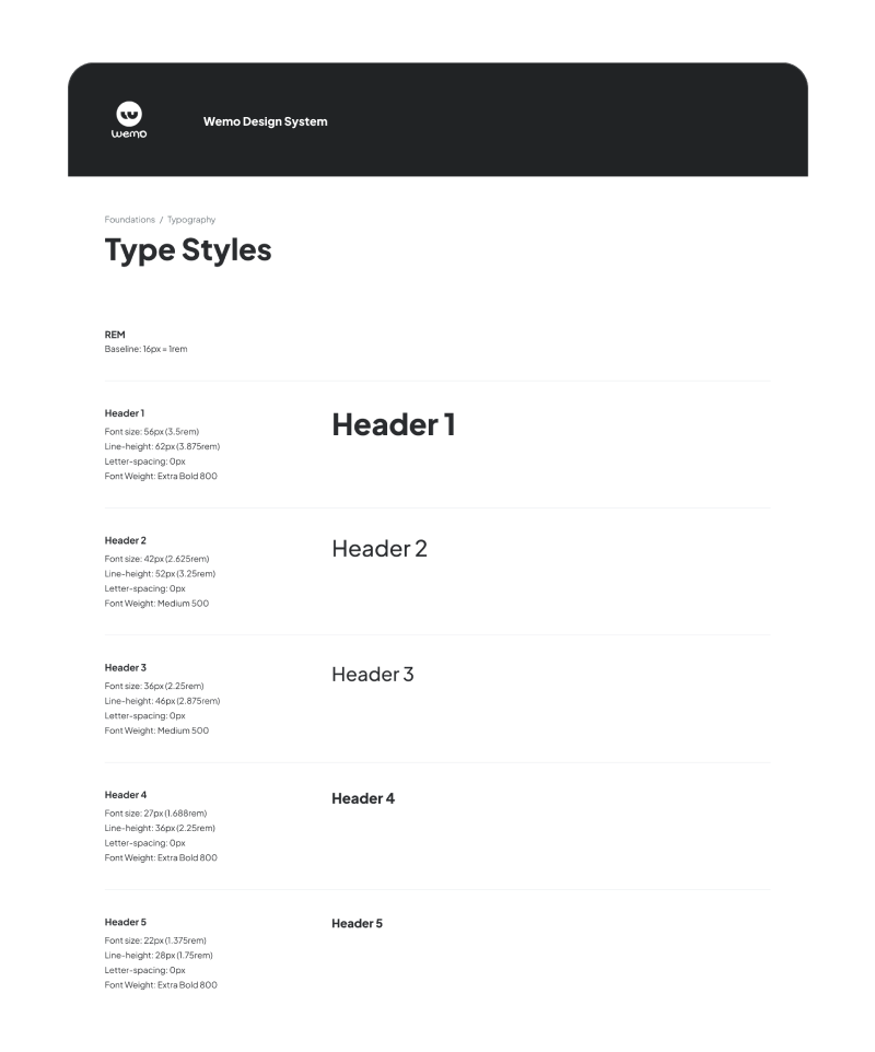 Type styles
Patterns
Full-page structure is assembled from reusable section patterns that support portfolio storytelling and case study depth.
Headline and circular portrait balanced in a two-column layout.
Subtle gray surface for grouped prototypes followed by a centered-eyebrow concept grid.
Featured work cards use large motion-rich foreground imagery on desktop, responsive tablet art positioning that keeps imagery clear of title text, and compact 260px mobile cards with static foreground art to the left of the heading.
Hiring-manager narrative page using the homepage visual language: case study pager navigation, compact metadata chips, a purple case-study eyebrow above a homepage-scale hero title, canvas-based role and contributor context, direct transparent artifact imagery on a case-specific Atomize gradient surface, at-a-glance summary cards, full-width three-column transparent foundation cards with item icons, centered foundation goal cards, specs carousels with lightbox previews, split image-only component and property cards on darker artifact panels, process sections, outcome cards, matched local assets, and scroll reveal motion.
Summary and takeaway cards use the same surface, border, radius, type scale, and reveal behavior, while image-led outcome cards keep media in a fixed-height top container with copy below so deeper case study pages still feel connected to the homepage system.
Photo hero with a delayed scroll-linked rounded-container-to-full-bleed entrance, dark text-side overlay, Info 500 title rule, soft-white skill labels, and translucent skill chips pinned near the bottom of the image, followed by the biography area, current role block, and white career highlight cards with compact purple eyebrow rows pairing a small icon with a short theme label.
